
Last March 20, 2024, Fairyloot dropped the digital mockups for the first four books of the popular fantasy series ‘Throne of Glass’ by Sarah J. Maas and the public reception … has been overwhelmingly negative. For proof, look no further than their own Instagram post comments.
The way I see it, the people had three main issues with this drop.
Issue #1: Dust Jacket Design

A lot of people didn’t like the Earth tones as it made the whole set visually underwhelming. Personally, I agree.
The very first book I read from SJM was ACOTAR. That whole series (still ongoing) gave me such a huge book hangover (in a good way) that I could not read anything for several days after. It’s such a high fantasy series with complicated characters and intricate plot that it was just hard to move on from and find the next book that’s just as exciting. Because of that I hopped on the Throne of Glass series where I’m currently on ‘Empire of Storms’ and I gotta say that despite it being slower than ACOTAR in terms of worldbuilding, intensity, and character complexity, it is just as magical. In fact, it is already on par with the ACOTAR series in terms of complexity and stakes in Queen of Shadows (Book 5).
The muted Earth colors just don’t match the high intensity action that the books embody. I would understand this color scheme for something cozy, low fantasy, fantasy for an older audience, or classical works. But Aelin – the main character of the ToG book series – is a fiery, young protagonist and she’s an assassin that went through so much bloodshed to get where she is that the muted colors just don’t give her journey justice.
Issue #2: Edge Design
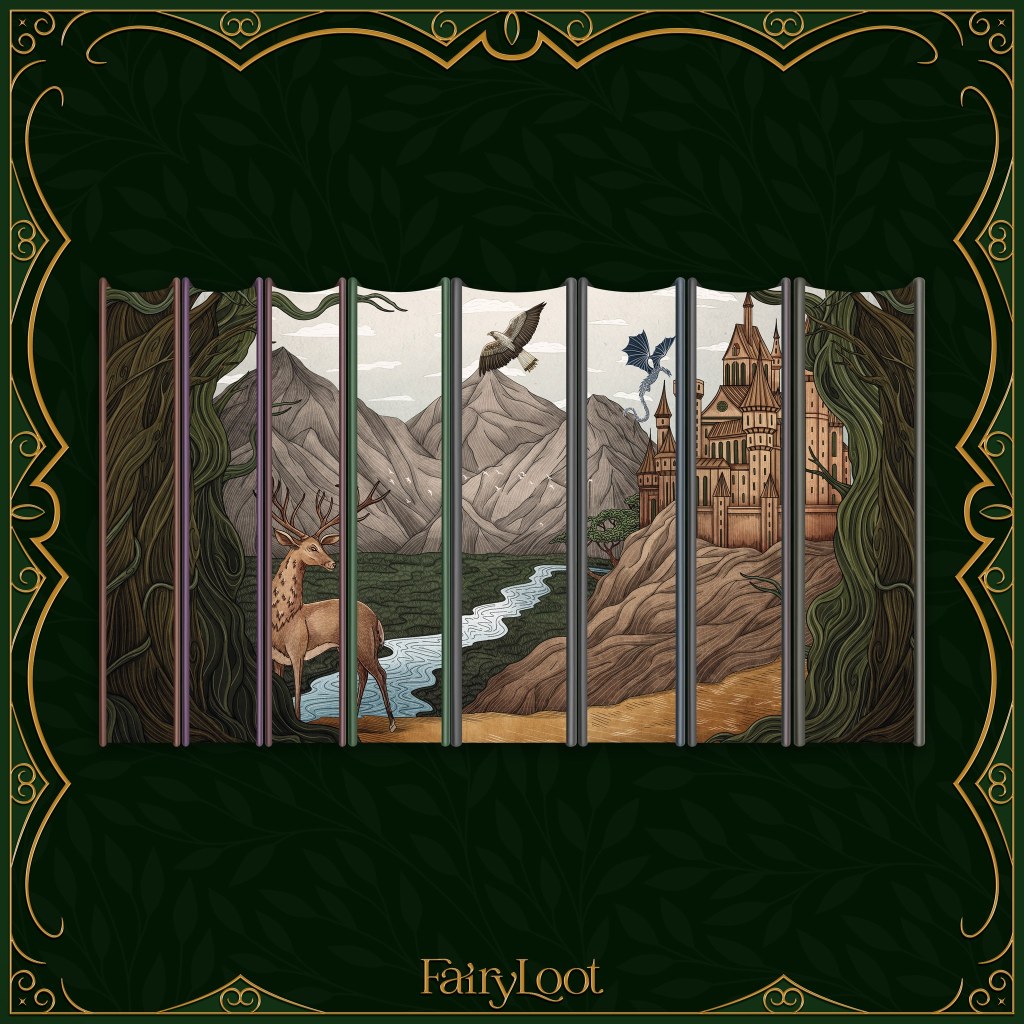
There are two main gripes with the edge art. First, the alleged color inaccuracies. Second, that it was allegedly plagiarized from another company.
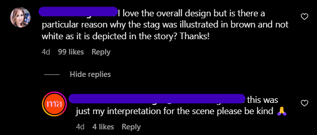
In the book there is a character called the ‘Lord of the North’ appearing as a white stag with a flame between its antlers. The Fairyloot edge shows a regular brown deer and people are unhappy. ‘If you’re going with that particular animal anyway, why not opt for the remarkable character instead?’ I say alleged because it’s not explicitly stated that it’s supposed to represent the Lord of The North in the Fairyloot edges. When questioned on Instagram, the artist responded that it’s her interpretation – unable to give clarity if the deer was really intended to be the Lord of the North or just a regular deer.
There were other details being debated such as the color of the wyvern near the castle. It is not confirmed whether or not it was supposed to represent the sky-blue companion of Asterin or the more prominent wyvern Abraxos who is supposed to be black. Ideally speaking, Manon’s wyvern Abraxos should be the feature since Manon plays a larger role in the series.
The other detail in contention is the bird. Was it supposed to be a generic eagle or Rowan’s white-tailed hawk appearance? People are voicing their opinions that if it’s the latter, then the colors are once again wrong.
Now, the castle. The series is literally called Throne of Glass and the glass castle is a prominent architecture. There’s been debate that this is actually the castle of Aelin’s home kingdom so it’s not supposed to be glass. However, even then, the castle looks too much like wood than stone (normally colored gray) and it just doesn’t make sense that a royal family of fire-wielders would construct and live in a castle made of wood.
But perhaps the most dangerous allegation of all is that it’s a copied version of the earlier licensed design of AcryliPics Bookish Nook:
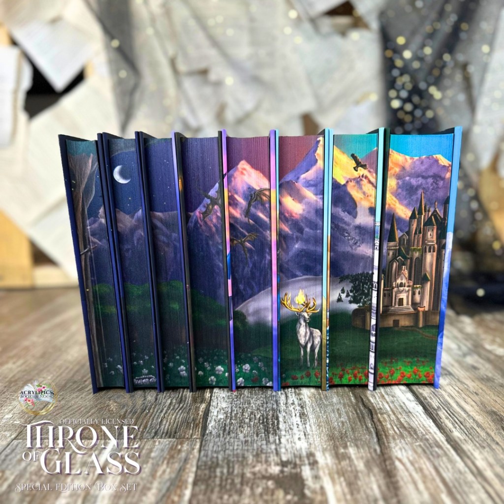
Fairyloot’s artist mentioned that she has never seen this before and, honestly, I am inclined to believe her just because I have never seen the AcryliPics’ version too until people started commenting it. To add to her defense that many other artists agree with, she was probably given a prompt and it must have been similar to the one given to AcryliPics so this was probably an accidental outcome. Whatever the situation is, SJM’s team has given licensing to both companies so they should’ve been the one who flagged it during the approval process. Now that I’m thinking about it, perhaps it was intentional because SJM’s team wants the officially licensed designs to be similar for branding purposes? That remains to be a conjecture on my part.
My take on the edge design? It beautifully matches the Earth colors but for this series, again, it’s just underwhelming. If there was an option to include prominent architecture and characters in the edges, why not do that instead of drawing generic counterparts? If it wasn’t supposed to be generic and it was an artistic interpretation, then that’s even worse because the colors are clearly already stated in the books and should not be open to interpretation for mass commercial purposes like this. As Aelin said in Empire of Storms, symbols are important. Unfortunately, having a more vibrant already-existing licensed edges from another company that looks similar to it just added fuel to the fire.
Issue #3: Price Point
The first four books in the Fairyloot set is currently priced at $200 USD without shipping. While that is around the same price as the Crescent City series they released from the same author (Crescent City was priced at $98 for 2 books so $49 each), there are multiple factors that make the ToG set more questionably expensive.
The first books of the ToG set are significantly thinner than the Crescent City ones. According to various sources such as Goodreads and Amazon, the page count of the hardcover editions of ToG are as follows:
- Assassin’s Blade: 448 pages
- Throne of Glass: 406 pages
- Crown of Midnight: 432 pages
- Heir of Fire: 565 pages
- TOTAL: 1,851 pages
Now, compare that to the Crescent City series they released with two books:
- House of Earth and Blood: 803 pages
- House of Sky and Breath: 805 pages
- TOTAL: 1,608 pages
Despite the individual book’s lower page count, each ToG books is priced at $50 while the Crescent City books is priced at $49 each. The price per unit doesn’t make sense especially considering that the Crescent City series has individual slipcases and ToG doesn’t. Everything else that come with the bundles are similar: the foil on the hardcovers, the artwork, the digitally sprayed edges, etc.
What makes the ToG prices worse is that AcryliPics’ 8-book set is priced at $325 putting it around $41 per book. This version is also licensed by the SJM team and they’re releasing all the books in one go which means there’s no risk for getting an incomplete set compared to Fairyloot’s two-batch release. On top that, AcryliPics’ set includes multiple page overlays!
My personal issue with the price is that there’s just not enough author presence in these books. They’re not signed – not even digitally, there are no annotations, no author letters, no bookplates… why should we be paying so much then?
Other Concerns
There are actually more things that fans are outraged about but I didn’t want to put issues where I feel almost neutral about. For example, a lot of people were dissatisfied with the character art but I don’t have any strong opinions on it. I don’t love them but they’re not bad either. Character art and endpages are not really dealbreakers for me when buying a set that I’d really love to have.
There were also accusations of Fairyloot initially deleting Instagram comments but Fairyloot later released a statement saying that it was an Instagram glitch and a lot of people backed them up since it also happened on other popular accounts.
Cyberbullying
Because of these issues where Fairyloot took too long to respond to, the artists unfortunately got the brunt of the complaints. I was watching the Instagram comments in the first few hours of the Fairyloot drop and, honestly at that point in time, the comments were just criticizing the art itself. Even on the cover artist’s page, the comments were still pretty respectful.


However hours later I noticed that the comment section turned feral on both the Fairyloot posts and the artists’ accounts and that was the moment I said ‘yeah, this isn’t okay.’ Thankfully, a lot of other people also defended the artists in the comments. Unfortunately, the people who were absolutely vicious got the better of the artists. The artist who made the dust jackets and edges released an official statement promising to discuss some changes with Fairyloot and the other artist who made the character art decided to quit posting any SJM-related art ever.

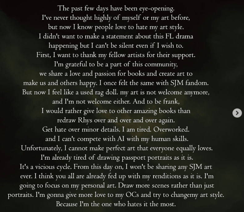

Official statement by the character artwork artist last March 22 on Instagram in response to the backlash
My take? I don’t think people should be silenced when they’re dissatisfied with something. It’s clearly okay when the artists and the company are capitalizing on the fandom for likes, purchases, shares, self-validation, and hype when the opinions are positive. Suddenly it’s not okay for the fandom to engage when they don’t like it? No. I don’t think that’s fair.
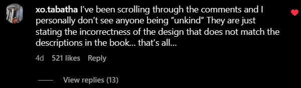
That said, the people who are bullying and personally attacking the artists are out of line. Before throwing accusations like using AI and plagiarism, we really should have better proof than circumstantial evidence. We should give benefit of the doubt for things like the artist having their own style for the characters looking so similar, the artist not having 100% knowledge of prior art, and other stuff like that. We’re entitled to have suspicions, but we should tread lightly on the public accusations. If they’re false, we’ve already done an irreparable damage.
A lot of people are saying that this situation has turned toxic because it’s the SJM fandom. I disagree. The internet has always been like this. The bigger the fandom is the more varied the personalities are and the fandom comes to the radar of really toxic people. It’s been that way for popular movies, singers, television shows, YouTubers, and so many other aspects. The other side of that coin is that that volume of supporters is what makes the celebrated piece lasts longer and generates more demand for customized commercial products. At the end of the day, we should all remember to give our feedback respectfully and try to avoid making generalized statements. It’s not fair to lump the people with respectful and valid comments with the bullies just because anything being said that’s not positive is being taken automatically as an attack to the artists when it’s not.
Fairyloot’s Response
Disgracefully, it took Fairyloot 2-3 days to act on the backlash. They posted a pinned comment on the initial post to acknowledge the situation…
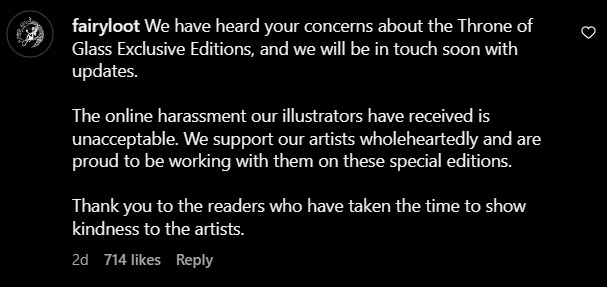
…and it took another day to release an appreciation post to defend their artists.
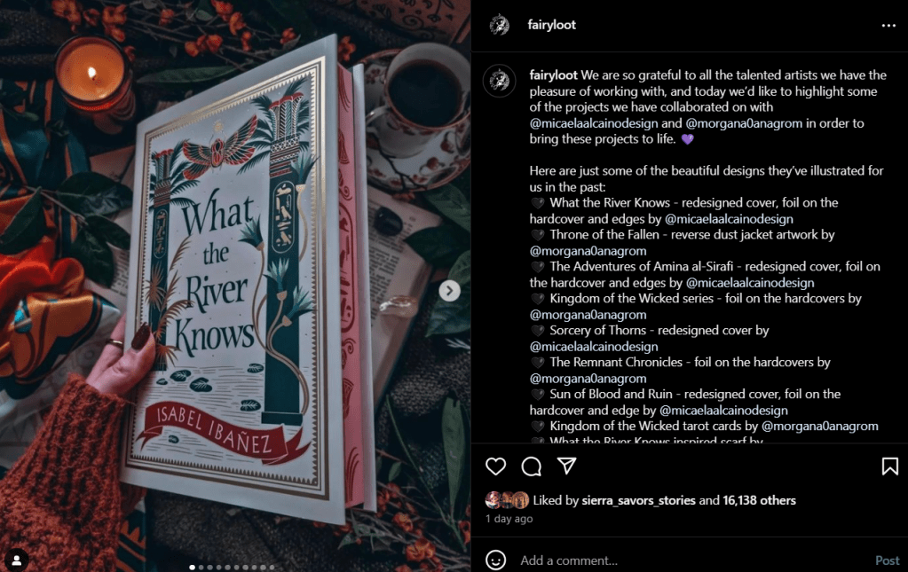
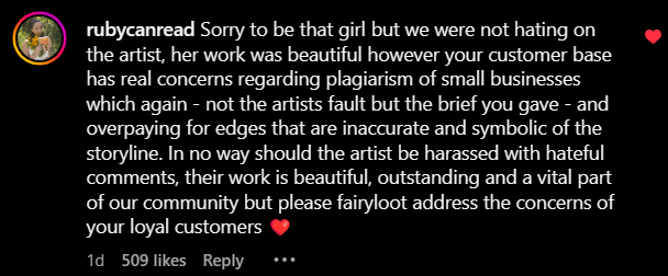
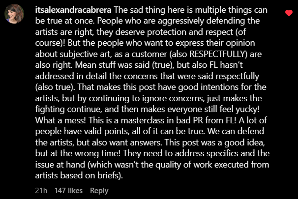
The top comments of this post already voiced out my thoughts so to give credit to them I’ll just post the comments that echo most of my sentiments with a caveat here that I would’ve worded some things differently.

Final Thoughts
Will I be buying this set? No. Aside from being underwhelmed, the thought of possibly not having the other half is too much risk for me to take especially since the edges are all connected. Plus, the fact that there’s another company offering the same set with an art style I like more, has more product inclusions, and has a significant lesser price for the full set ($325 from Acrylipics vs. $400 at the least for Fairyloot)? Practically speaking, it just doesn’t make sense for me to get Fairyloot’s version.
Will the Fairyloot ToG set still sell out? Of course it is. First, a lot of other people still like the designs. Second, there are always people willing to pay this premium no matter how dissatisfied they are due to FOMO (fear of missing out) and/or just pure love of collecting. Third, resellers who buy these to mark up the price later would happily buy them. I feel really uneasy about these things because it doesn’t push the company to be better. At the end of the day they get the money and the backlash will disappear. Considering that Fairyloot is posting regularly again with no backlash in the comments days later this incident is proof enough.
Do I think Fairyloot will make changes to the art? Not likely. I’ve only been following Fairyloot for a year and I already know they’re not the type of company who bows down to their customers. As long as their products are flying off the shelf and dollars are coming in, that’s really the only validation that counts. Not to mention that there are probably a lot of internal workings already underway so it’s too late to stop without losing money.

Leave a reply to Geena Cancel reply